Google Cloud Platform

Recommendation Hub
Active Assist's
Enterprise Saas
Cloud technology is complex. We wanted to leverage the power of Google Cloud's data, machine learning, and artificial intelligence to simplify over 5 million user's entire cloud experience.
To comply with my non-disclosure agreement, I have omitted and obfuscated confidential information in this case study. All information in this case study is my own and does not necessarily reflect the views of Google.
Project type
UX design contract onsite with Google Cloud
Duration
12 months
Skills
Rapid prototyping, wire frames, user flows, mockups, cross-functional collaboration, design systems

Role
I helped design and launch a new tool on Platform Intelligence, a cross-functional product team, consisting of designers, engineers, PMs, and researchers.

Connection
Learning the lay of the land
Before diving into work, I started by setting up lunch or coffee with people on our team to get an understanding of what they had tried before, what went well or didn't, and who I could go to for different types of assistance. This helped me to understand the team’s style and build relationships and mutual understanding for the coming months.
And during these conversations, our challenge quickly became clear.
We knew that the cloud computing industry had some serious problems.
Across all cloud users:
OVER
30%
Cloud users' time spent on network troubleshooting
OVER
90%
Permissions are over granted
OVER
70%
VMs are over provisioned
We were asking people to make decisions that computers would be better suited to calculate
“Almost half of C-suite executives cited cloud complexity (47%) as the factor that will have the most negative impact on cloud computing’s ROI over the next five years”
-Deloitte Cloud Complexity Management Survey Results
But we knew it could be better than this
The team
My role
Our team functioned with one full-time UX researcher, two full-time engineers, one full-time PM, and two UX designers, along with a dozen folks augmenting those roles in part-time ways.
The senior UX designer focused on information architecture and user journeys. I focused on user flows, prototypes, user interface, and visual design.
Our project touched on almost every aspect of Google Cloud's platform. Our partner list was immense. Over the year I sat in on meetings with billing, security, analytics, storage, and dozens of specific product teams. Building trust and enthusiasm for the project was as important as understanding technical needs in each new connection.
I also sat in live testing with software engineers, systems administrators, heads of IT, and data scientists. Learning to understand the scope of their work was central to making sense of the features that would be relevant to them.


Research
Competitive analysis
I dived into research and analyzed competitors and third-party tools by looking into their UIs, published reviews, internal user feedback, and studies Google had already conducted to prioritize the critical needs and most-demanded features for an automated recommendation system.
Terraform, Ansible, Chef, and Puppet were all examined in addition to Azure and AWS.
Design and prototype
Key principles
Recommendations where you work
Billing recommendations need to plug into the current billing page. Permission recommendations need to plug into the current permissions page.
Recommendations
hub
There would be a central hub that gave folks an overview of all the recommendations they had access to so they could comb through them.
Tell users what the future look like
Complex recommendations, particularly around billing contracts or permissions changes, would be modeled to show users what would happen if they chose to act on them. No guessing.
When possible: an "undo" button
Cloud systems are often too complex to undo actions on. Somewhat like withdrawing an ingredient from batter. But whenever possible, we'd offer a way to rewind.
Rough patterns
I began to lay out rough UI patterns and worked with engineers to prototype the basic functionality early in the project. Breaking features into must have and nice to have was key. I discussed the overall product vision with PMs and senior designer, as well as prototyping and tweaking UI treatments with developers.
A couple dozen card layouts were tested with our users
User testing


(Redacted) results from 180 users
Partnering with our UX researcher
Our dedicated UX researcher helped me build tests that looked at different types of users and what tasks they wanted Recommendations to simplify for them. Variations of the how, where, and when of these recommendations were explored and documented.
Rapid prototyping let me take in one round of test results and adapt the UI to get further clarity out of the next round. Sitting in on the majority of the tests myself gave me nuanced insight into user's sentiments that spreadsheets alone couldn't capture.
Progress
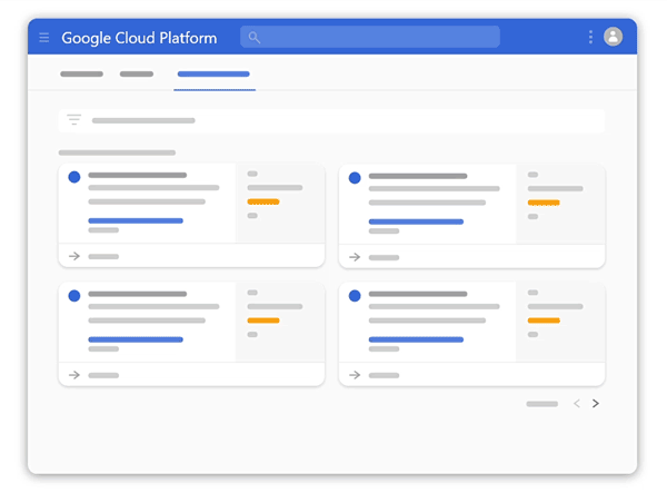
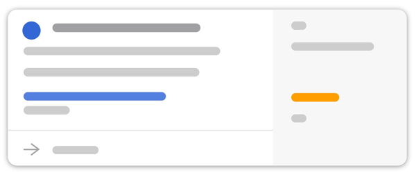
Recommendation hub: basic anatomy
The core user experience takes place over a recommendation hub, a list view, and a detail panel.

Recommendations hub
The main landing page features cards that bundle together similar recommendations.

List view
Clicking into a card shows a list view of the recommendations bundled into that card.

Detail panel
Clicking into a recommendation opens a detail panel with more info and the chance to customize, enact, or dismiss the recommendation.

A functioning ecosystem
The Recommendations hub would add a third tab to the GCP platform. Making sure the UI patterns worked at the user-flow, multi-page level was important, even before we settled on detailed designs
Alpha testing
Real-world trial
Opening Recommendations to select customers for our Alpha release allowed us to iron out further gaps between customer's expectations and our performance. But the essential response from these key customers was awesome.
“I have been dreaming about this feature since 2 years ago.”
9.5
Million unused permissions removed
Major music streaming service
“This is by far one of the best things we’ve seen in Google Cloud.”
Major news publisher
“Networking security insights without us having to specify anything is magic, real opportunity for Google to differentiate.”
Enterprise-level customer
Shipped results
The final screens we put into production still bear the hallmarks of an engineer-heavy technical UI. But thanks to testing I knew that they were intuitive, easy to scan, easy to digest, and easy to act on.

Shipped recommendations hub

Shipped recommendations list

Shipped recommendation sidesheet

Shipped recommendations in context
Reception
Here's my coworkers Chris Law and Dima Melnyk rolling out the results of over a year of my team's hard work.
"Active Assist’s Policy Troubleshooter is going to make my life so much easier. I can't begin to tell you how I've suffered from generic error messages in the past. Policy Troubleshooter is exactly what we need to quickly find, understand, and fix policy misconfigurations. "
Paul Friedman, Sr. Security Engineer, Square
"[Active Assist's] IAM Recommender does all the heavy lifting. It was very easy to auto-apply all the recommendations we got."
Abhi Yadav, Sr Cloud Security Engineer, Uber