


MovieLens
Unsolicited, unused personal project | Mobile app
Bridging the gap between the movies I'd like to watch and my inability to think of any of them when I have time to watch a movie is a growing interest of mine.
MovieLens is an interesting project from the University of Minnesota. It has some creative and powerful algorithms to find movies you haven't seen yet but are likely to enjoy. It excels in computer science and data, but struggles in the user experience department.
The key to MovieLens' recommendations is a rich data set of your own ratings of films. The more films you rate, the better your recommendations become.
But there's a serious speed bump in the process. Once I tap a film to rate, I'm taken to a new page with a wealth of data about the movie. I can rate the film there (although there are some further problems we'll look at in a minute), but once I've done so... nothing happens. I'm at a dead end.
My only action is to hit the back button on my browser. Which would be a totally navigable UI oversight for me. Except. You're taken back to the top of the list of movies to potentially rate. So you now have to scroll past all of the films you haven't seen and can't rate to get back to the fresh part of the list.
This makes rating films cumbersome and frustrating.
For this project, I'm doing an unsolicited redesign of the user experience with MovieLens. I'm doing it as an Android app in response to a mobile website so some of my work won't directly translate. But I still hope that this could be a useful exercise is strengthening a product with so much potential.
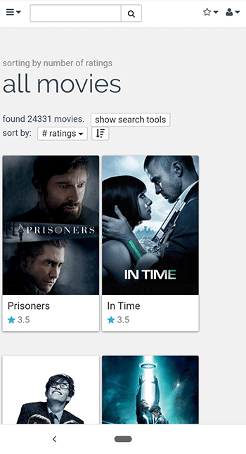
The current MovieLens experience
The MovieLens mobile website is laid out in a pretty traditional way. The homepage has multiple groupings of movies such as "top picks, recent releases, rate more," etc. The groupings all have a tapable headline and one horizontal row of movies under it. You can tap an arrow to see more films to the right of the visible ones, or another arrow to move back to the left of the list.
Not a biggie, but I would definitely want the more intuitive swipe interaction to replace the left and right arrows.


Rate more secondary page
If you tap the "rate more" headline, you're taken to the "rate more" secondary page. There are some cluttered buttons at the top. Upon closer inspection it turns out they are the sort and filter tools.

There's also some awkward spacing, alignment, and grouping choices.
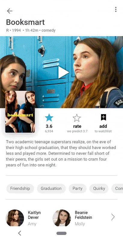
Rating a specific movie
If you tap into a movie on the list, you're taken to a new page. This brings us to the second largest problem I came across. The rating tool you need to use is already filled in with a rating. The fix that is needed is to strip in the star meter so that it's blank. But it also raises the issue that there should be no ratings shown during this user task. They will heavily bias the user, leading to inaccurate data.
When you do rate the movie, your stars show up as orange. Additionally a very tiny circling arrow appears next to your rating.
With experimentation I was able to figure out the circling arrow undoes your rating. I also had to experiment with the thumbtack and X icons. It turns out that they save the movie to your watch list and hide the movie from being included in your results, respectively.


And the problem
Tapping the back arrow takes you back to the top of the list of movies.
What I would do differently
Follow along as I process out loud, if a bit non-linearly.
Rating the movie
Here's what I'd change up with the rating process.

So next to the average rating, there's a bar graph icon. It opens in a dialogue modal window.
This chart is nice and clean, and really highlights what MovieLens does well.

First I would toss a far more condensed version of the move info into a similar dialogue.

Let's clean up the alignment a bit.

Let's bump up the size of the add-to-list and hide icons. I'm going to get rid of the button outline around the bar graph icon as well

It's easier to recall a movie from a poster than a trailer still, so we'll go that way.

Now the biggie. Let's clear out those stars so we have a blank slate to rate from. Make them big for fingers and put them in the center.
Plus I got rid of the other ratings so as not to bias the user.

Once the user rates the movie, we could put back in some of the rating data.

Neither the tack nor the X icon are passing any comprehensibility tests. I'll start by just labeling them

OK. Let's pause and actually get this into something resembling Google's material design standards for Android.

Let's simplify the star rating information.

And organize it so it's easier to scan and digest.

Then let's get the Add to watchlist icon redesigned and arrange it and the Hide icon better.
I don't love the bookmark icon for adding movies to lists, but it's definitely the most commonly used.
Back to the list of movies to rate
Told you it would be nonlinear

So I need to make some sense out of the search tools up here. They're pretty complex to navigate.
I'm going to go ahead and put all of the filter functions up in the top bar in a filter icon.
I'm also having the images for the movies take up the full width of the screen.

This now gives us all of our filter functionality in one sheet
I would need a lot more user data to know if this is the best plan. But one way or another this messy UI has to be cleaned up.

Then I'd pull the cards connecting the film art with the titles to get a cleaner look.
As well as adjust typography and colors some.

The dated movie covers that I happened to snag in my screenshots are starting to drive me nuts, so I replaced them.
I also placed an overflow menu icon on the first image and an add-to-watchlist icon on the second. I'm not sure how I feel about them yet.

I think I'm going to go ahead and move the sort by tools up with the filter tools.
I switched the filter icon to an adjust icon to reflect the increased breadth of variables that can be changed there.

Here's the new combined sheet.

I'd want to test some or at least research having these settings in a child page rather than sheet, given how extensive they now are.
Home page, navigation drawer, navigation
Zooming out to the app's larger architecture.

So here's the home screen adjusted to match our design choices.

The navigation drawer here just reflects their current menu.
Tapping the navigation drawer control (hamburger menu icon) opens the navigation drawer

Rather than relying solely on the navigation drawer control for navigation, I'd want to add a bottom app bar.
Here I included all of their top level menu options except for Home and Movies by genre, as they didn't feel parallel to the other options.

But I suspect it would make more sense to break the app down by user tasks rather than architecture. I would then subdivide the navigation with a tab component at the top.
It seems like users are here to add movies to their watch list (explore), rate movies (for better recommendations) and reference their watch list for movies to watch.
Looking at a specific movie
It would be nice to run several designs by users for testing. But something in this ballpark would be where I would head
(Not in the context of rating it specifically this time, just exploring)
More design choices
A few odds and ends to address
So it turned out that MovieLens did have a way to rate movies without clicking into them. But it's a mess.
If you click on the movie title / rating, it will open an overlay that you can rate the movie in. But the majority of the time the tap to open the overlay also rated the movie for you. And about 20% of the time it just opened the link to the movie's page anyway, maybe due to tiny target sizes.

It seems like a reasonable feature to have, but the functionality would need a lot of improvement.
Still, I wanted to mock up a layout for it. I kept the other ratings in the layout because this is in the Explore tab, not the Rate movies tab.


List view
MovieLens' list view is pretty unhelpful. So I mocked up a more helpful one.

Dark mode
I hear it's all the rage.
New features
What I'd build next
Multiple lists
I need more than one giant list of movies I want to watch. Documentaries, movies to watch with the kids, etc.
Shared lists
I want to be able to have a list of movies to watch with my partner. And I want her to be able to edit the list as well as me.
TV
It feels like the lines between series and standalone films has become too blurred to arbitrarily exclude TV